
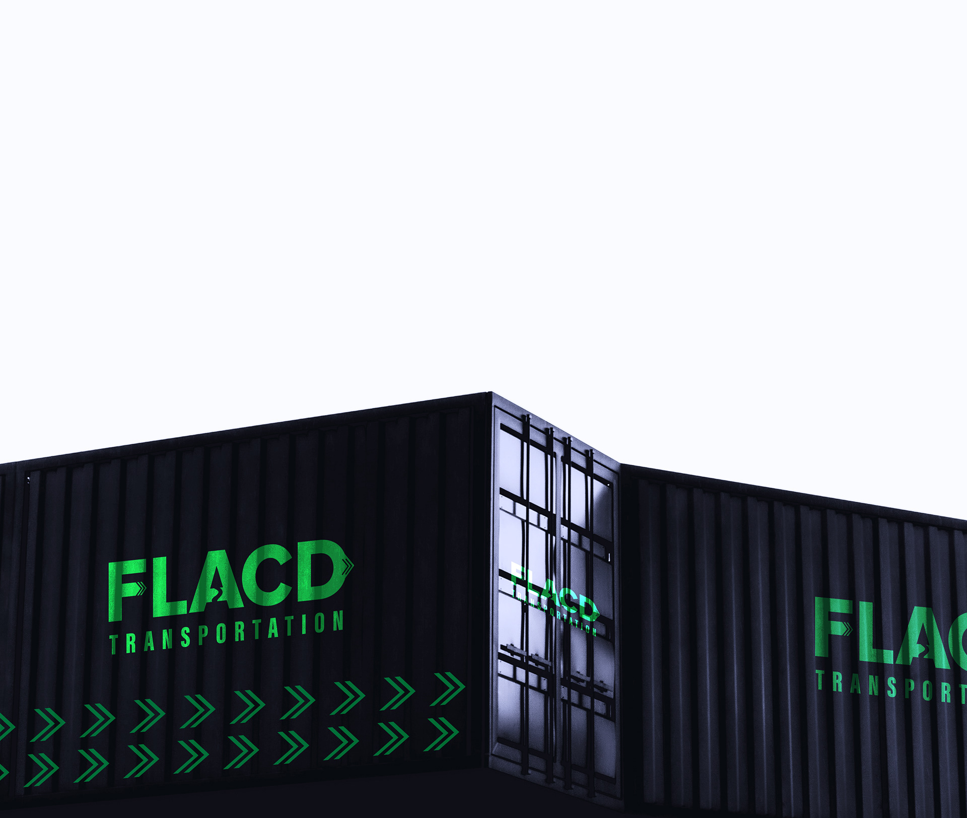
CONTAINER BRANDING
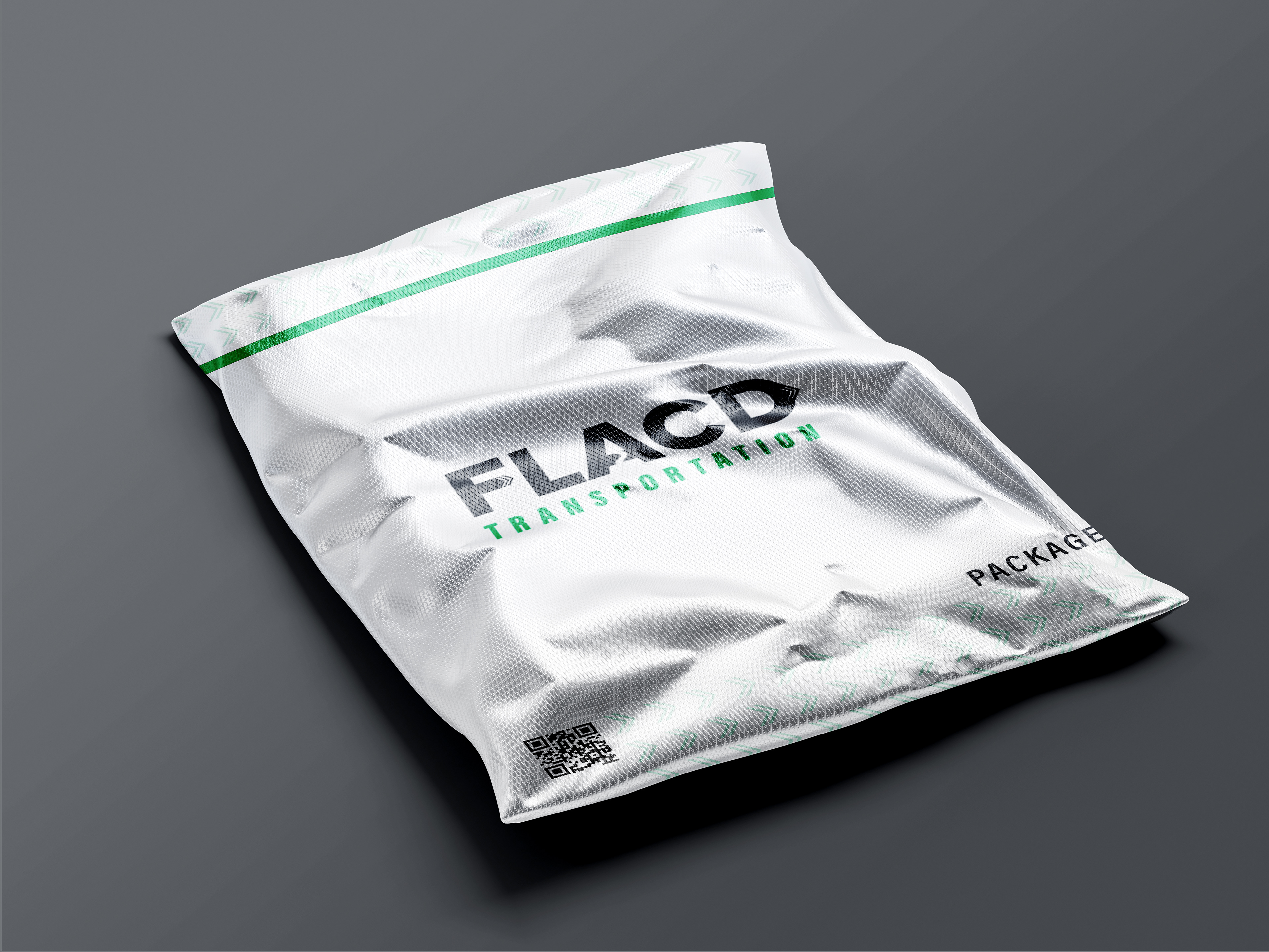
PACKAGING
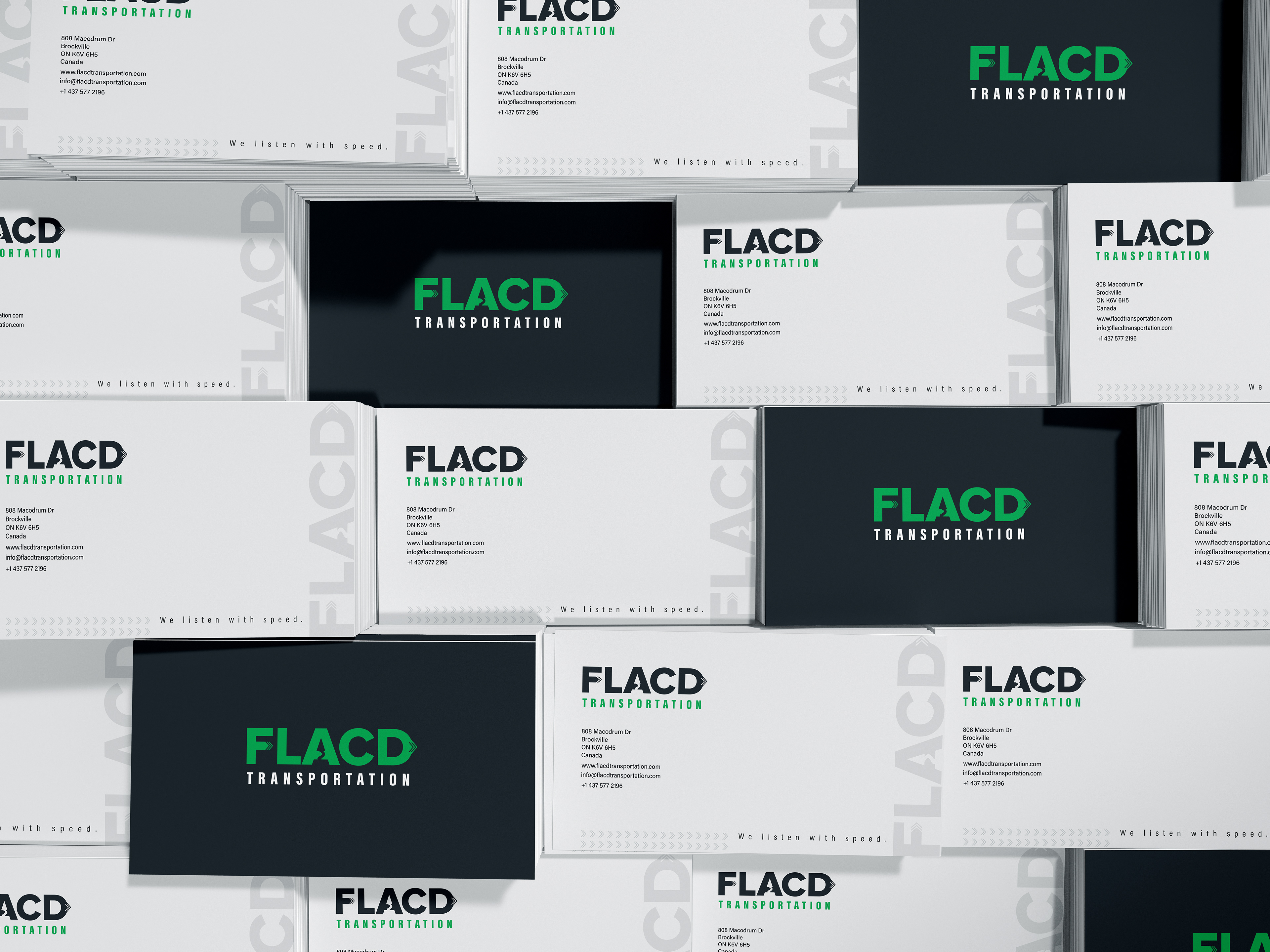
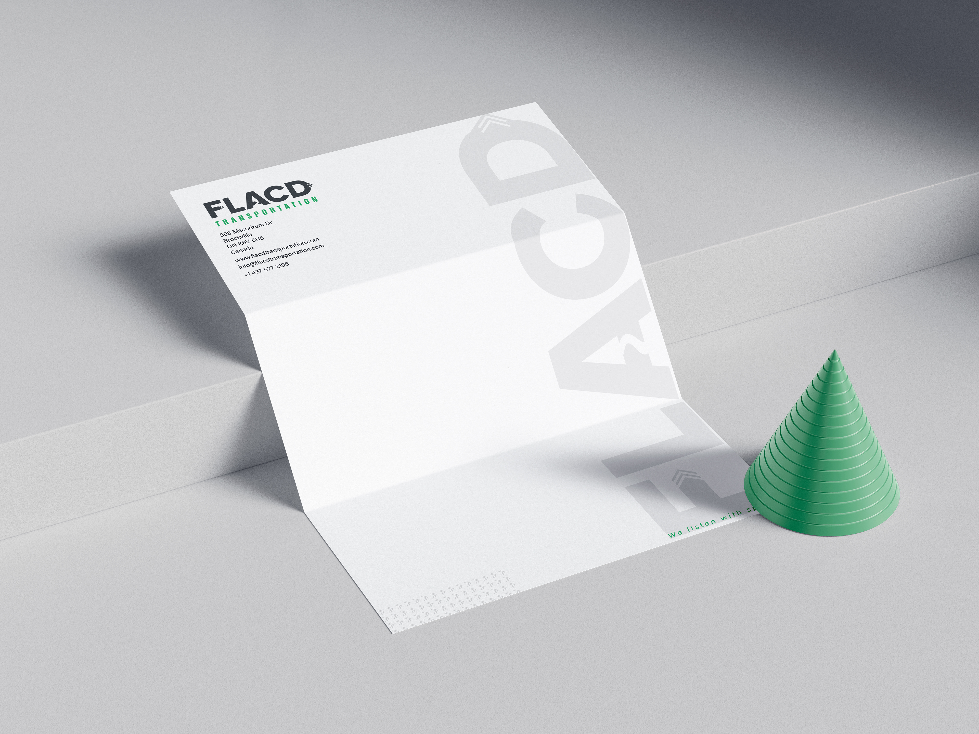
Branding Rationale FLACD Transportation, is a family Canadian-based broker company. The logo is made from each family member initials including the parents initials. It is a very sensitive project for me. I wanted to make the initials stand out more and make them the emblem but still communicate what the company does. I chose the green as it signifies innovation, growth, and a dynamic approach to transportation solutions. This complements the dark navy green, instilling a sense of reliability and strength, establishing a visual identity that is both distinctive and memorable. The modern typeface that is both bold which enhances readability and contributes to a contemporary brand image. This branding strategy, with its carefully chosen colors and design elements, aims to position FLACD Transportation as a modern and trustworthy player in the Canadian brokerage landscape.